Share Better Screenshots On Social Media [Step-by-step guide]
Written by Jim Raptis
Feb 29, 2024
![Share Better Screenshots On Social Media [Step-by-step guide]](https://www.notion.so/image/https%3A%2F%2Fprod-files-secure.s3.us-west-2.amazonaws.com%2Fc028931f-44ef-40a4-ad3e-004309f8d43d%2F48de7638-424b-4c74-8006-fd790a4cc346%2Fbrandbird_(14).png?table=block&id=91e17094-7da5-4847-8d0a-5418ed3336a7&cache=v2)
Visuals help creators boost engagement on 𝕏, LinkedIn, and Instagram, leading to a more effective build-in-public strategy, which is a fact backed by science.
Studies have shown that visual content is processed 60,000 times faster by the brain than text, which makes it the most effective tool for boosting attention and engagement on social media platforms.
Let’s explore the best practices for catchy screenshots on social media with a practical example.
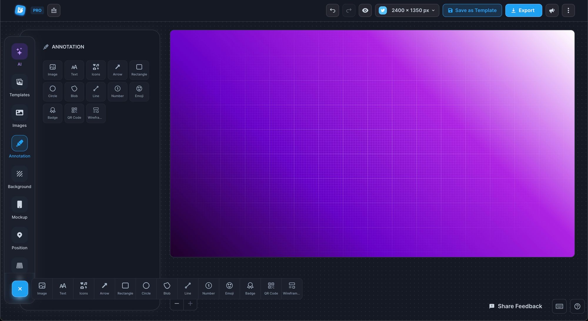
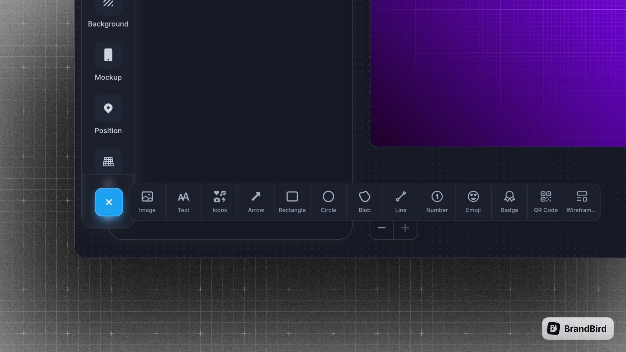
We’ll try to turn the screenshot below (it displays a new feature – a redesigned annotation menu) into a better graphic for social media with a few simple steps.
1. Use (too much) Zoom
Every post on social media (eg. a tweet) covers a specific part of the feed. Usually a small one.
You can’t afford to share screenshots that force the user to click & zoom in to understand its context. Most people won’t do it, and you’ll fail to communicate your new feature.
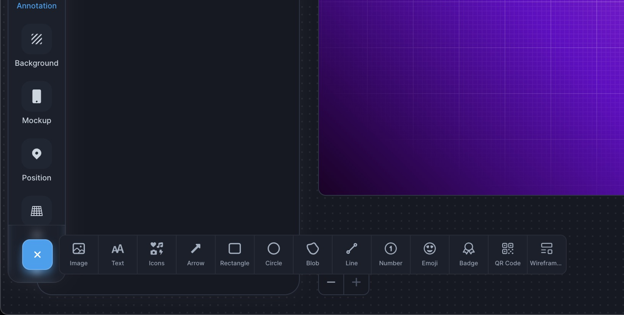
Zoom as much as possible and make it obvious which is the new feature.
2. Use Subtle Backgrounds
Unless you want to share a boring screenshot, you must make your screenshot stand out in chaotic social feeds.
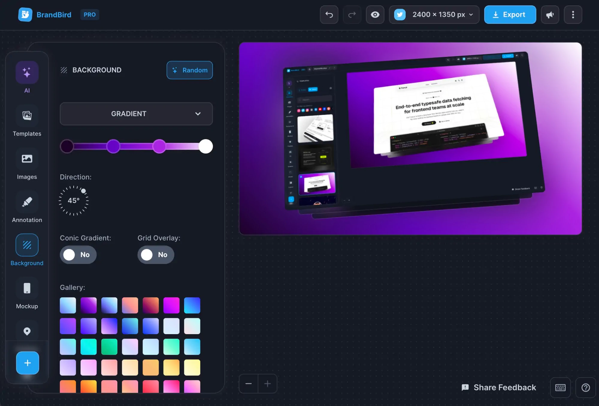
Adding a subtle background is the easiest way to make your screenshot pop with minimal effort.
Plus, it’s a very useful way to incorporate your branding and make your screenshots recognizable.
💡Tip: a consistent brand watermark boosts your brand awareness even further
3. Explain like I'm five
You have a few seconds to communicate your message clearly. Otherwise, users will keep on scrolling to find a more interesting post.
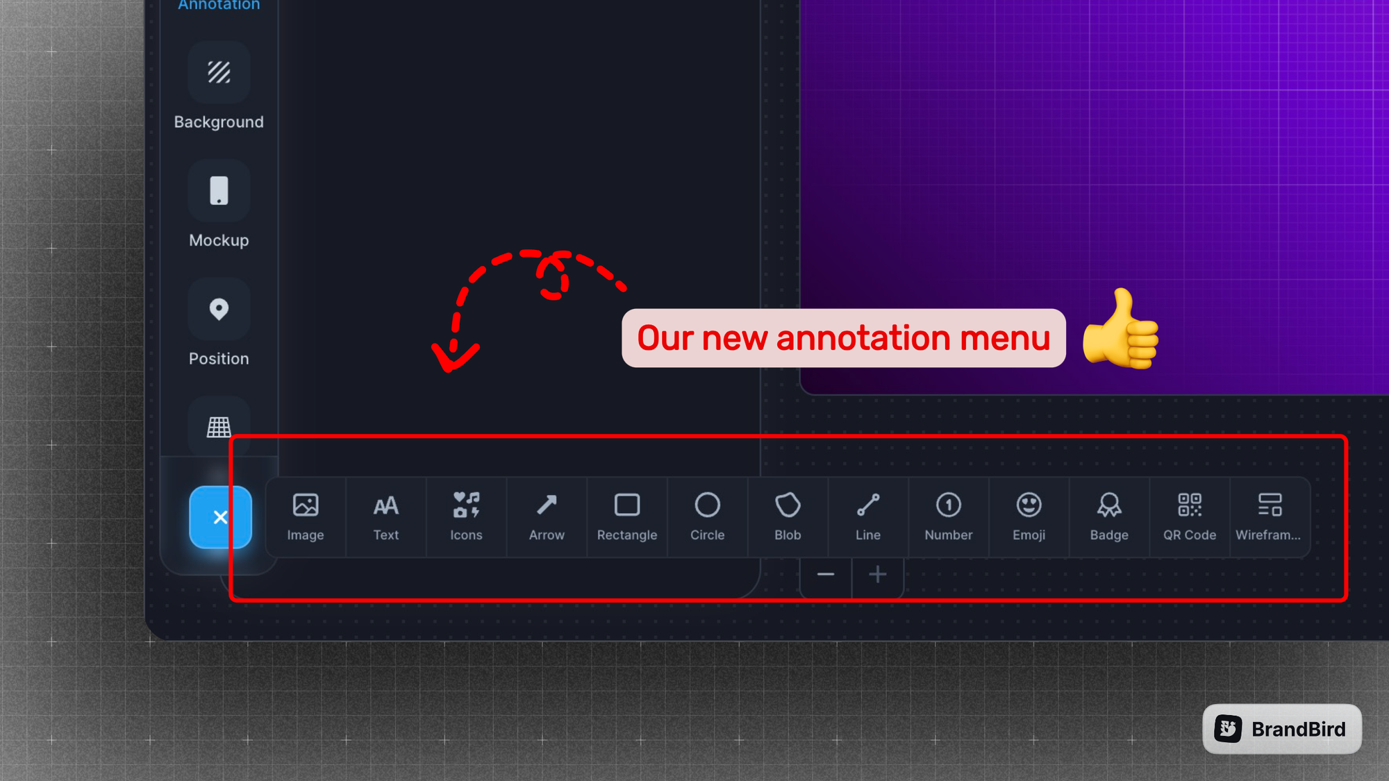
It’s crucial to convey your meaning as clearly as possible. The best ways are:
✦ Use arrows to point at features/ information
✦ Use rectangles to showcase areas
✦ Use plain text to explain further
✦ Use emojis (yes 🚀) to communicate emotions
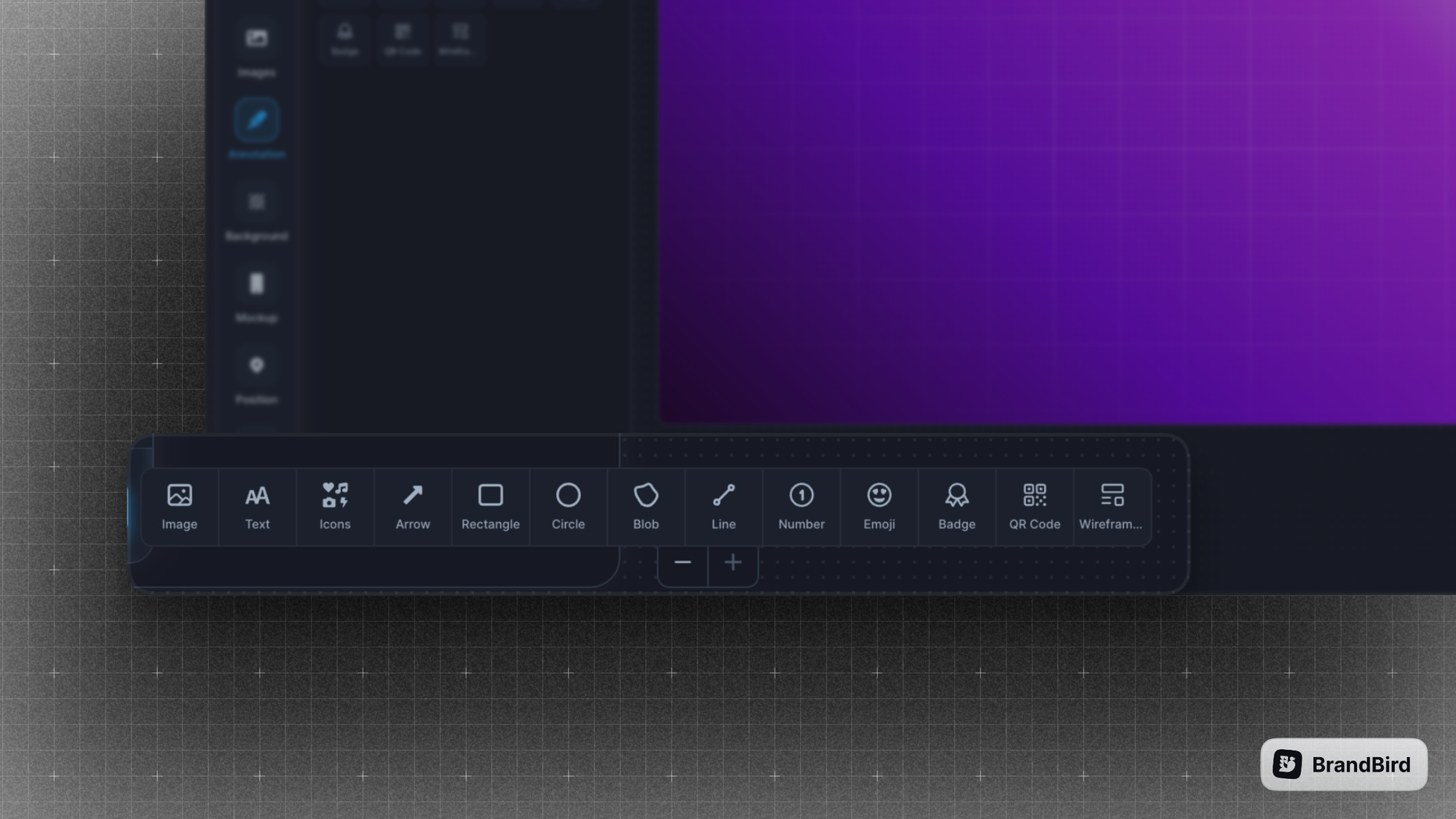
BrandBird supports another creative way to highlight features!
It allows you to create a magnifier glass effect and zoom in on your important features and information. It’s the perfect way to highlight a new element in your product.
4. Use the correct format
On Twitter/𝕏, you can (almost) safely use any format. People suggest using square or portrait format because it covers more real estate in the feed (especially on desktop devices). It’s a clever hack to force more attention into your posts.
Remember that this guideline might change in the future, and your old media posts might get cropped weirdly. That’s why I always recommend following the official platform guidelines.
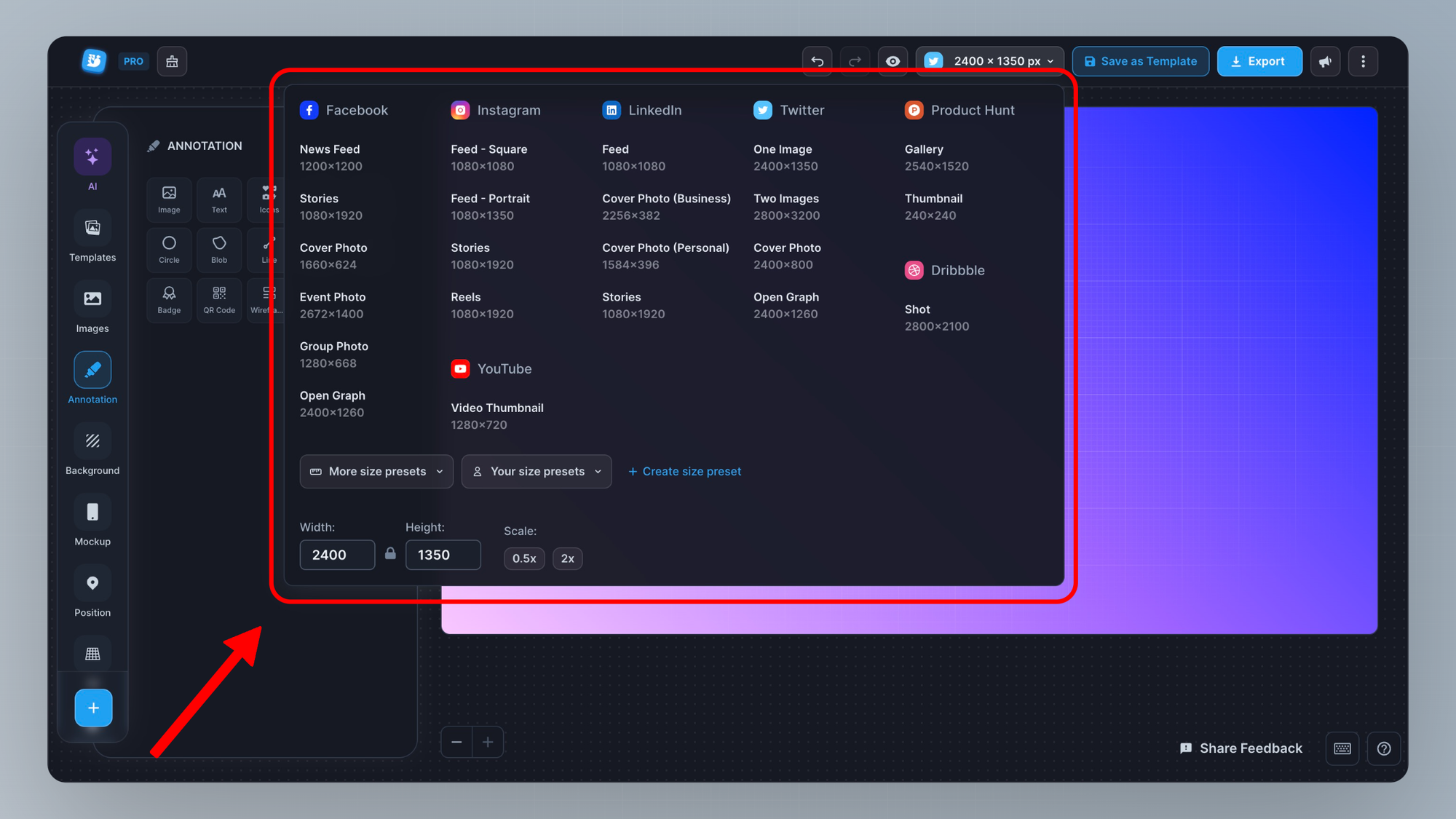
However, most platforms (e.g. LinkedIn and Instagram) use very specific ratios for their media assets. Then, you must follow these guidelines to avoid automated crops that distort your message and potentially even hide your primary information.
BrandBird natively supports all the native social media image formats, so you don’t have to worry about the official guidelines.
