How to Create Better Google Play Screenshots
Written by Zoe Anthopoulou
Jun 21, 2024
.jpg?table=block&id=7328bced-d2f4-4cb7-9117-cdd92c3bb4c4&cache=v2)
When creating your app’s page for the Google Play Store, you need to be aware that every element of this page can be the trigger for a user to decide whether or not they want to download your app.
Screenshots are one of the most important aspects of your product page and your Google Play App Store Optimization (ASO); perhaps the most important, as they can draw a user’s attention and make it more likely for them to stay on your page.
Users usually spend just 7 seconds on a product page, and as the human brain processes images 60,000 times faster than text, you may want to invest in your app’s screenshots as they can help you deliver the information needed more efficiently and before you lose the user’s attention.
But here’s a catch: it’s best to have your app store screenshots optimised to drive conversions, and not just upload any screenshots you took from your app. And since you have limited screenshots and time to convince a user to download your app, each screenshot should have a specific goal and purpose.
In this post, we will be sharing tips for better screenshots and some of the requirements of the Google Play App Store, so you can master the art of quality App Store screenshots!
What are the Google Play App Store requirements for screenshots?
The Google Play App Store has two different screenshot guidelines: the requirements and the recommendations. To have your app approved and added to the Google Play Store you need to match the screenshot requirements. But if you also follow the screenshot recommendations, you will increase the chance of your app being featured as a recommended app.
We will list both requirements and recommendations below for easy reference, but you can also visit Google Play’s Help Center for more information and suggestions.
Requirements
- You need a minimum of 2 screenshots: For your app to be approved you need to provide at least two screenshots, but you can add up to 8 screenshots for each supported device type. Supported device types include phones, tablets, TVs, and watches.
- You can upload images in 24-bit PNG or JPEG formats, but without transparency: This is pretty straightforward; only these two formats are allowed, and you cannot upload one with a transparent background.
- You must stick to the minimum and maximum dimensions: The screenshots you upload should have a minimum dimension of 320px and a maximum dimension of 3840px, but the maximum dimension of your screenshot should not be more than twice as long as the minimum dimension.
Recommendations
- Recommended number of screenshots for apps and games: For apps, you must have at least four screenshots and for games at least three screenshots, with minimum 1080px resolution and a 16:9 or 9:16 ratio.
- Use images taken within your app: This is recommended to prevent misinformation of the users and it means that your screenshots should demonstrate the actual user experience of your app and its features.
- Keep text to a minimum: It’s best that your taglines and text do not take up much space in your photo. You also need to make sure your text is legible and not overloading the screenshot.
- Avoid some key-phrases: You should not use any content or text that suggests performance or ranking, or any call-to-actions that engage with the users reviewing your app. Some examples are “Top”, “Sale”, “Download now”, etc.
- Keep the notification bar clean: The screenshots you submit should have a clean notification bar, meaning you should not show service providers or notifications and the battery, WiFi, and cell service logos should be full.
What makes a good Google Play Store screenshot?
Google Play Store screenshots should be designed to get the user’s attention and connect with them, but also help them visualise the app’s interface and features in a clear and visually appealing way. Plus, they should be consistent with your brand’s guidelines and overall brand image.
Here is an article to get you started with taking quality screenshots: How To Create Beautiful Screenshots
Now let’s review some points in more detail!
Connect to users
Visuals are a powerful tool for connecting with users, as they can evoke emotions and tell a compelling story about your app. And users are more likely to stick if they feel a connection with your app.
To achieve this, you can leverage screenshots to present use cases and benefits of your app that resonate with the user's daily life, highlighting how your app can improve their routine.
Moreover, including reviews and testimonials from other users in your screenshots adds a human touch, boosting the relatability of your app.
Showcase features
Screenshots are the easiest and quickest way to showcase your app’s features to a user. And as the first one to two screenshots are most likely to be viewed by your audience, you need make sure to use them to draw the attention to the most interesting features of your app.
Don’t forget that the rest of your screenshots are also important; bring forward the features that will bring the most value to the users, and show them how your app can help them in their daily life.
A good practice is highlighting the important areas in your screenshot, where you need the users to focus on, to ensure that you get your point across quickly.
Clean and simple
Your screenshots need to be clean and simple, especially for mobile apps, as users will view them on a tiny mobile screen.
You need to make sure that:
- you don’t clutter a lot of information in just one image; it’s important that users can quickly understand the features or benefits each screenshot is showcasing.
- your text is legible; it’s not too small, or placed in a background where it’s not visible.
A majority of images featured in the App Store are really simple; just displaying a screenshot from the app accompanied by one or two lines of text. And it works, if you choose the right screenshots!
On-brand
Branding should be a major aspect of your ASO as it can help your app resonate with your audience, reinforce brand identity, and ensure recognition among your audience. And this of course includes your screenshots, which should be designed to align with your brand’s guidelines and values.
What this means is your screenshots should be consistent with your brand’s color schemes, typography and tone, to resonate with your audience and ensure a cohesive and recognizable presentation.
Consistency in these visual elements will not only enhance the aesthetic of your app but is also essential for creating a professional image, ultimately attracting more users and driving more downloads.
How you can create quality Google Play Store screenshots with BrandBird
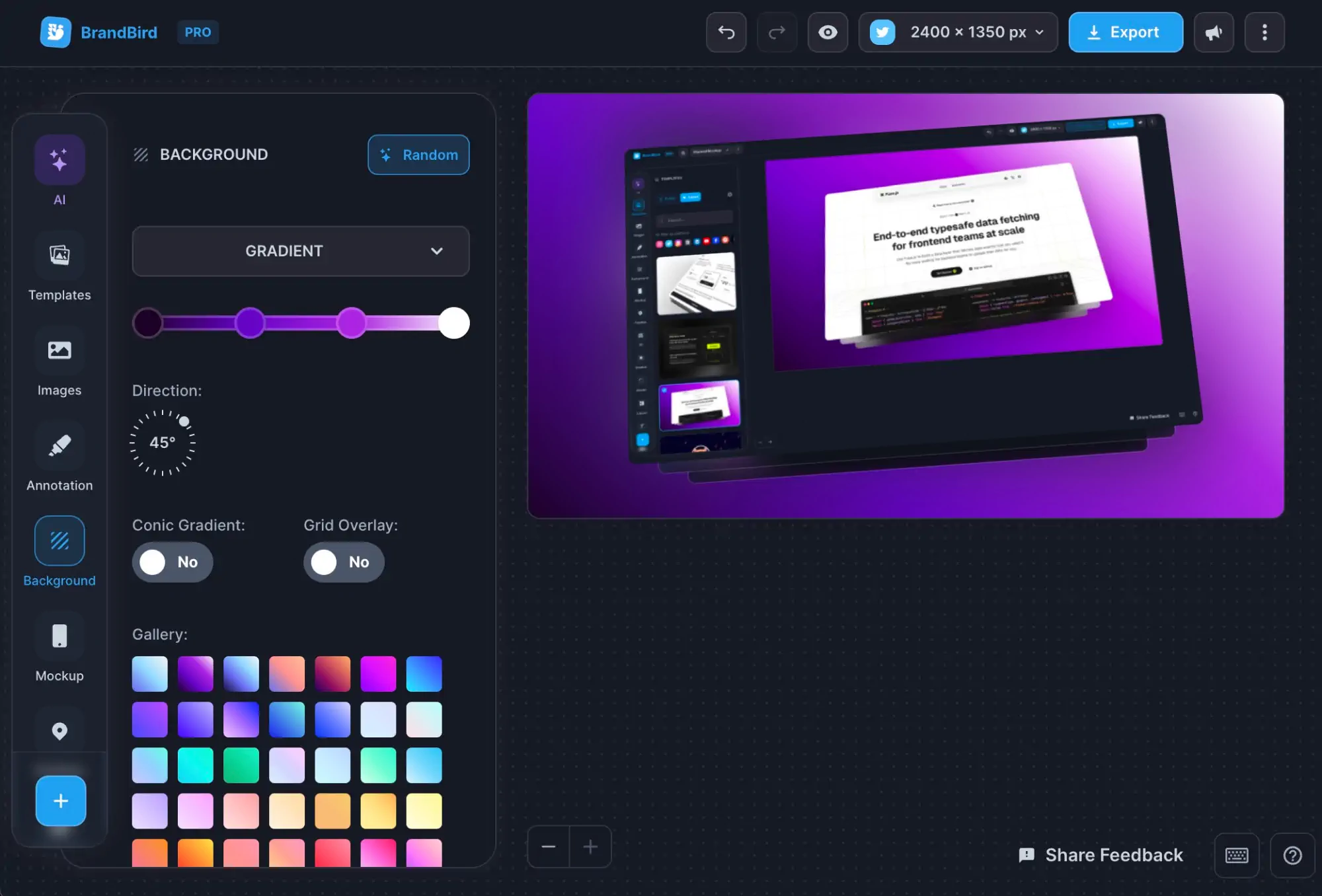
BrandBird is a powerful image editor that can help you create beautiful screenshot graphics in seconds. It offers a lot of editing options, including backgrounds, text and stickers to make your screenshots unique. And with the following points, I’m going to prove to you that it’s a great tool for your Google Play Store screenshots too.
But before I do, here are some examples of screenshots I created using BrandBird 👇 P.S. You can find those as templates, too 😉
.jpg?table=block&id=772a3d2e-b6ee-4d9c-9eb3-e1e2a73d6645&cache=v2)
Size Presets
BrandBird offers a variety of predefined canvases, including size presets for the Google Play Store. So, you can set up a canvas for your Google Play Store screenshots in just one click, without having to think about Apple’s guidelines, because BrandBird has already done this for you!
Highlighting Tool
To draw attention to important areas and parts of your screenshot, consider highlighting them. BrandBird offers an image highlighting tool that you can use to point out the key elements of your screenshots and guide the viewer's eye to what’s important.
💡Tip: Find more tips and tricks on highlighting images and screenshots on our 4 Ways To Highlight Your Features On Screenshots article.
Editing / Branding
Having uniquely designed and branded screenshots can set your app apart and drive more people to your app’s page. With BrandBird you can adjust your screenshot’s background to your brand’s colors, add your logo, and text in your brand’s font. Plus, we offer a variety of icons and stickers to make your screenshot playful and inviting to your audience.
💡Tip: Remember, simplicity is key here! You want to add enough to get the user’s attention, but not clutter your designs.
Templates
No design skills? No worries! BrandBird has a library of public templates that you can reuse and customize for your designs. You can also find some templates for the Google Play Store there!
💡Tip: Create your personal Google Play Store templates in BrandBird, so you can re-use your designs in the future.
See this template from BrandBird as an example:
.jpg?table=block&id=984e09e2-09ab-4d26-b4d5-be0ab01db93d&cache=v2)
By following these simple tips, you can create beautiful Google Play Store screenshots that will tremendously boost your Google Play ASO strategy. Don’t forget to have fun while creating, staying true to your brand and your screenshots will stand out and impress your viewers, for sure!

