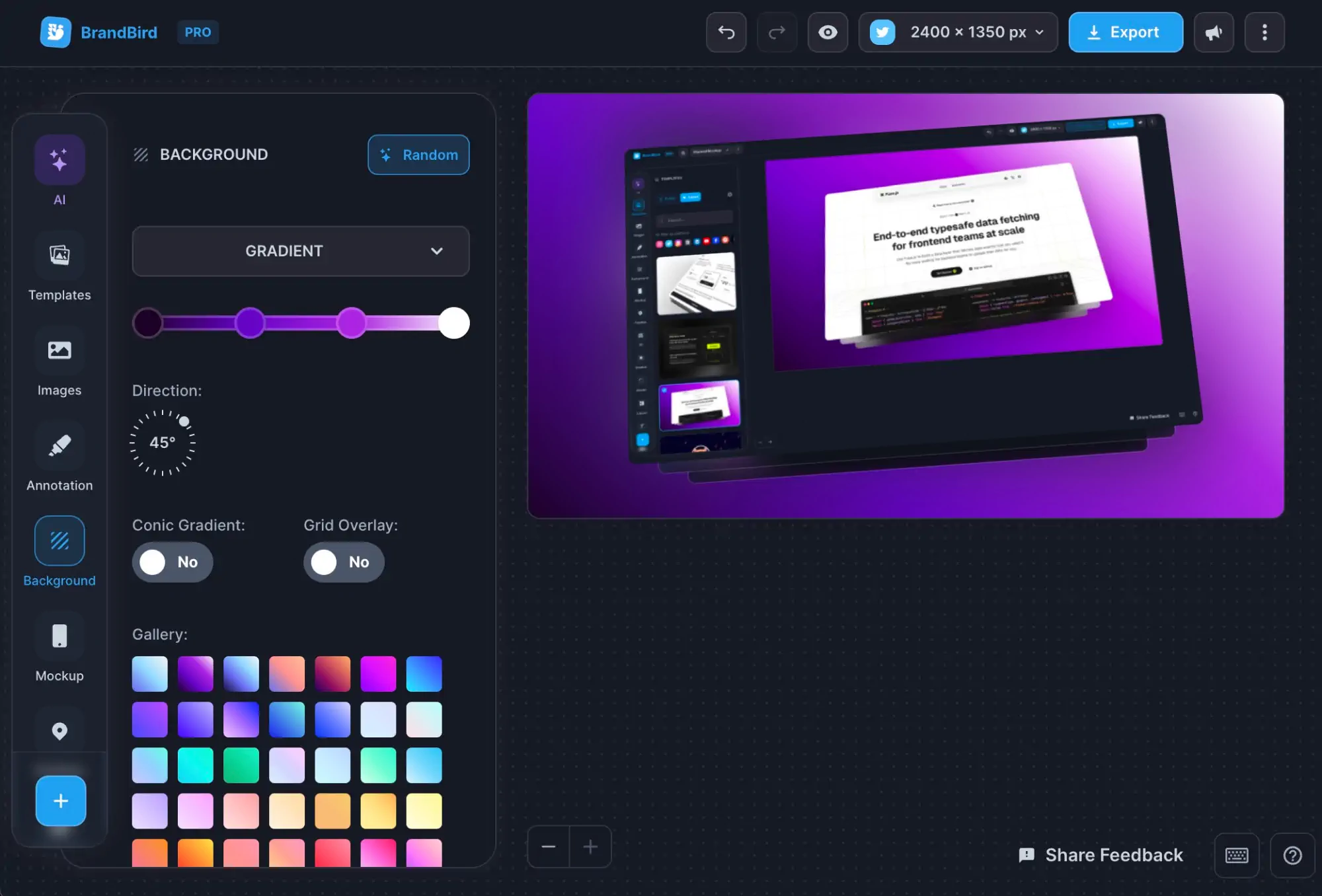
Best Templates In May
Written by Jim Raptis
Jun 3, 2022
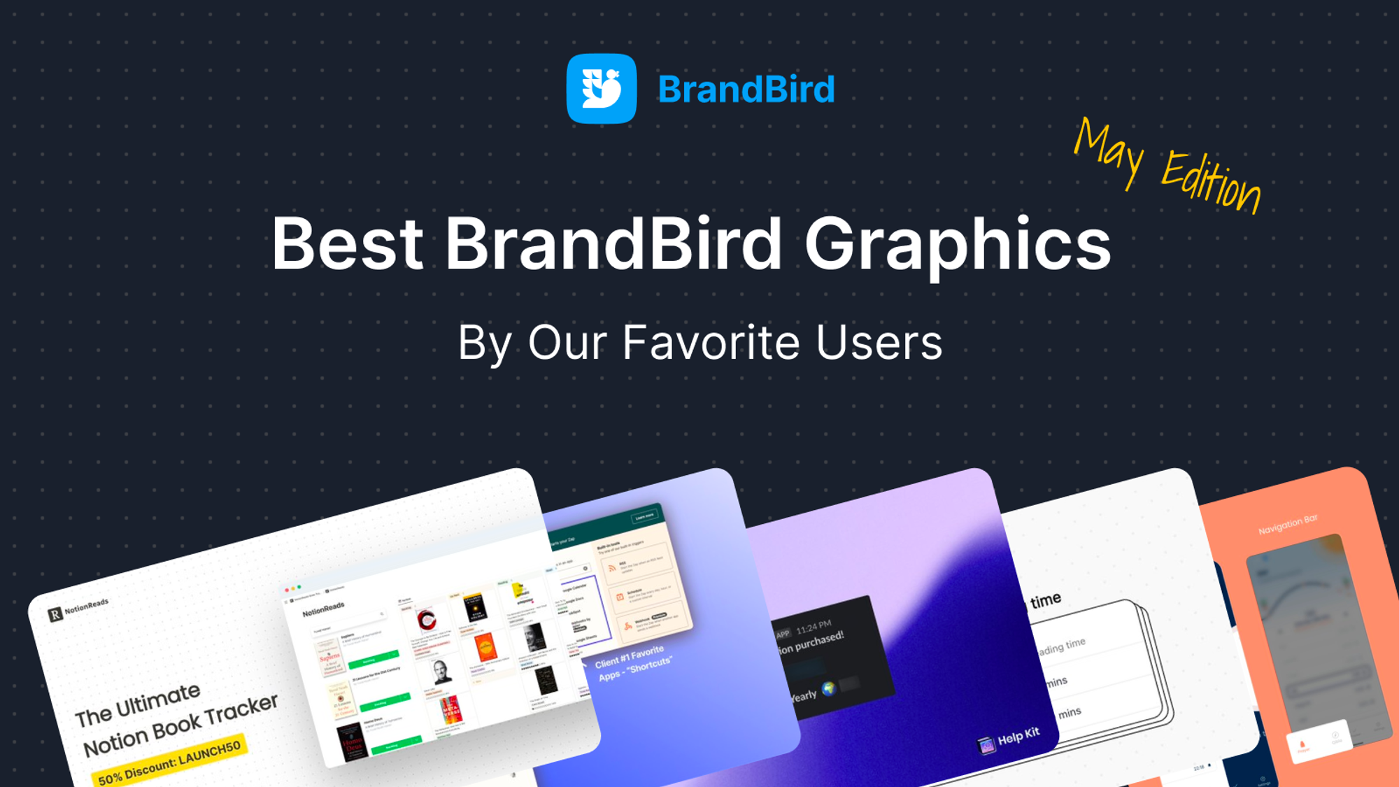
This new monthly series showcases the best BrandBird templates made & shared on social media by BrandBird users.
It’s the best opportunity to get inspired for your own graphics & unlock the full potential of the BrandBird studio.
For those who want to get featured, don’t forget to tag @brandbirdapp on Twitter when you post a BrandBird image.
Let’s see the best templates for May.
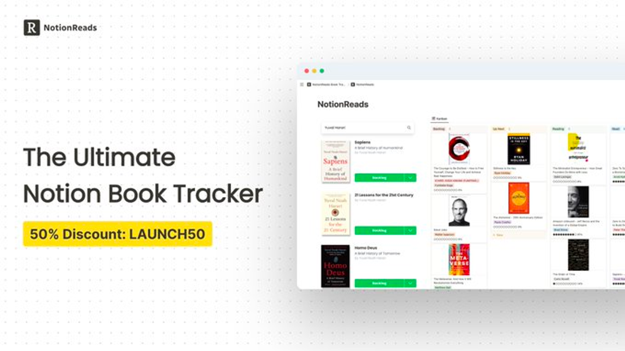
1. NotionReads by @RBouschery
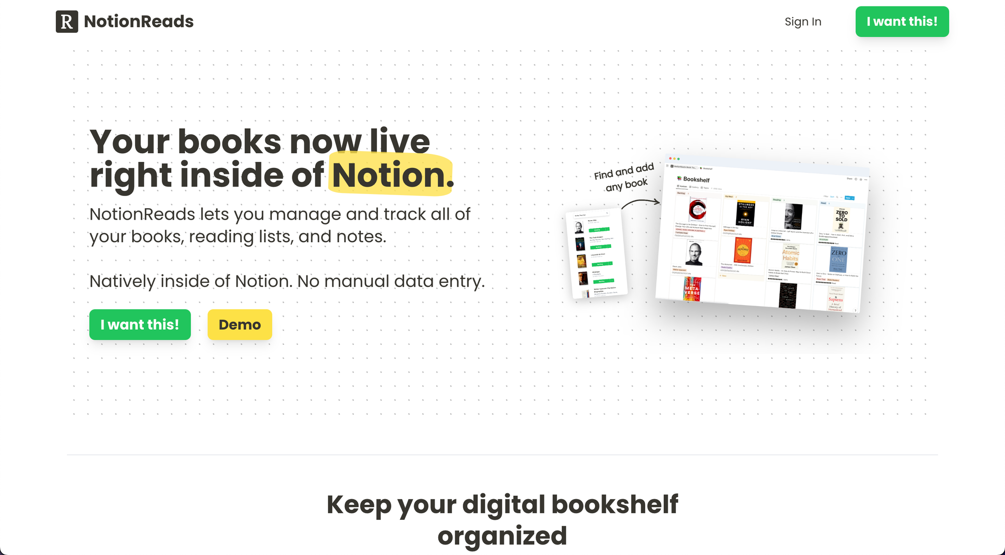
Robbie uses BrandBird for all his product graphics for NotionReads. From landing page hero image to Gumroad graphics.
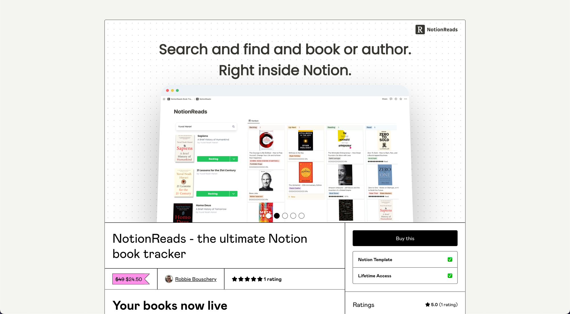
In this post, I want to showcase his top-notch launch graphic on Twitter.
Launch graphics are a great use case for the “Header” feature of BrandBird studio.
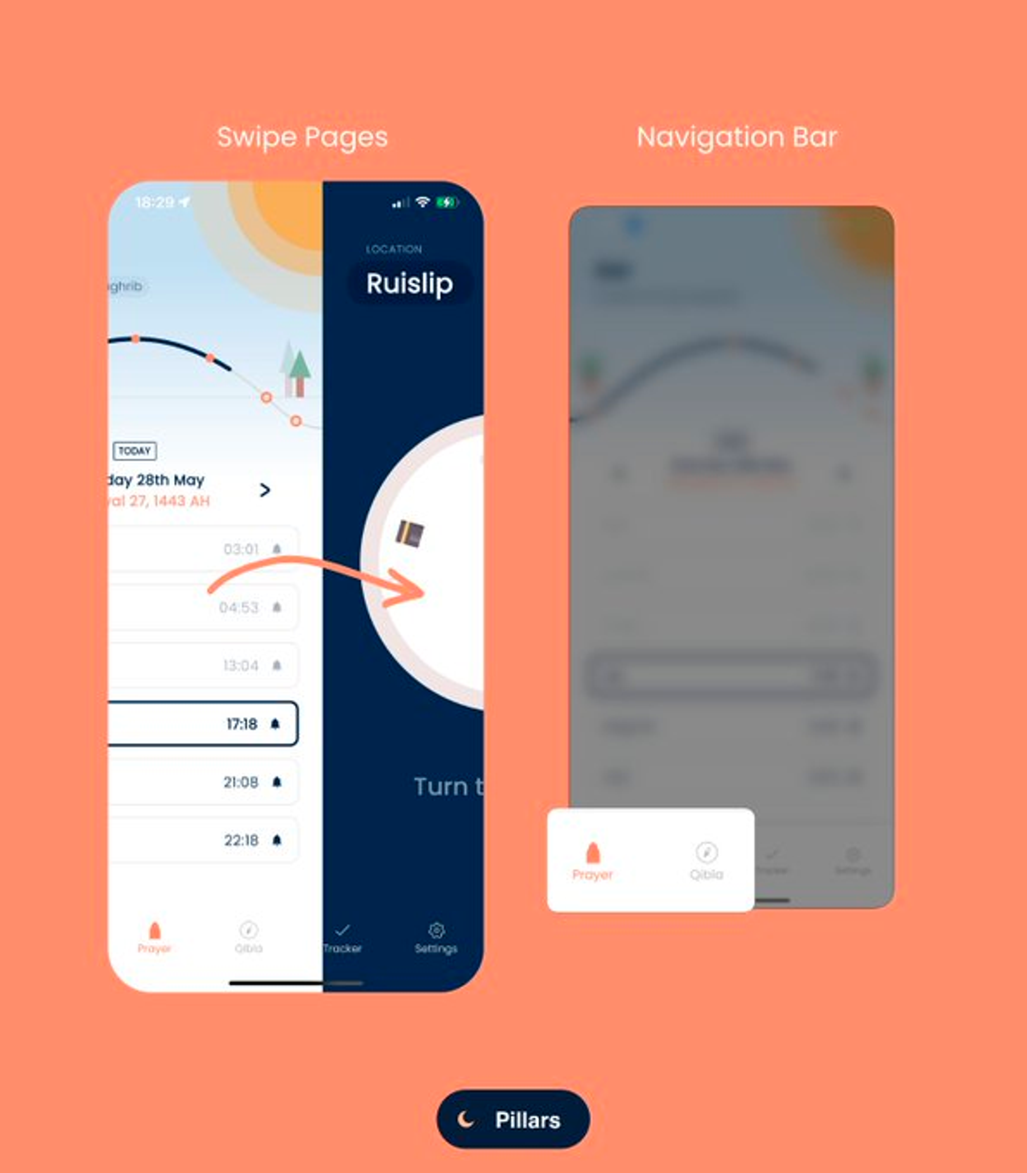
2. Pillar app by @asabbas98
Attention-grabbing colors with handwritten arrow annotation & the magnifier glass to highlight the bottom nav bar
It’s dead simple to highlight your app’s feature with the BrandBird magnifier glass feature.
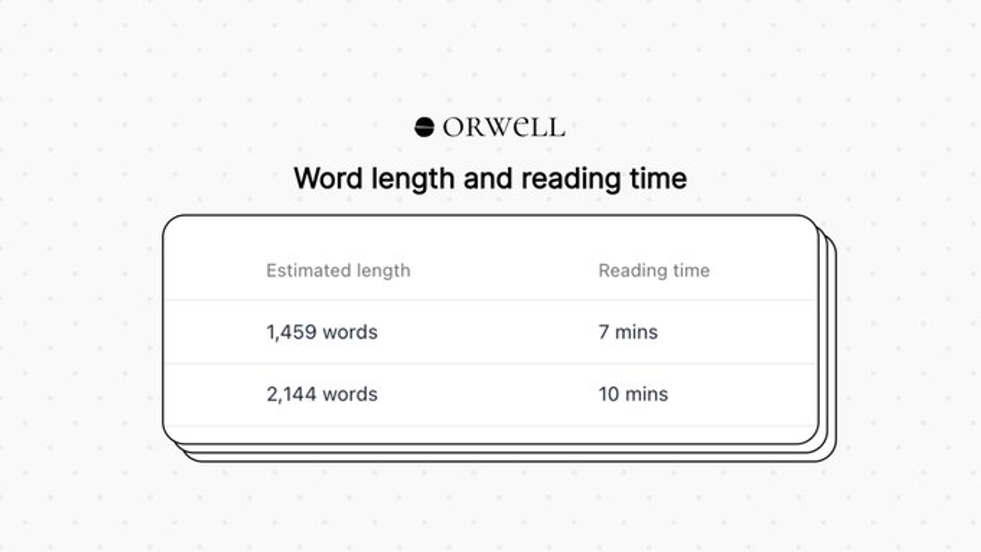
3. Orwell by @thebrokenfinger
Simple yet beautiful template with the retro mockup & a polka dot background.
A good reminder that a simple mockup can make your image look way more professional.
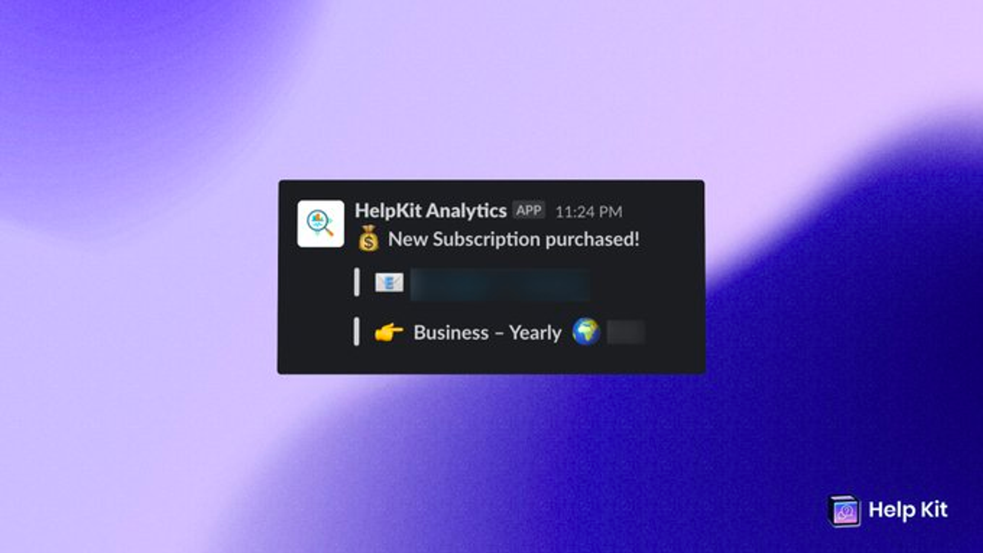
4. HelpKit by @sobedominik
Classic milestone announcement image with subtle blur to hide customer data.
Always remember to hide sensitive customer information. You can either blur these details or use the new pixelate option (which is a bit more secure).
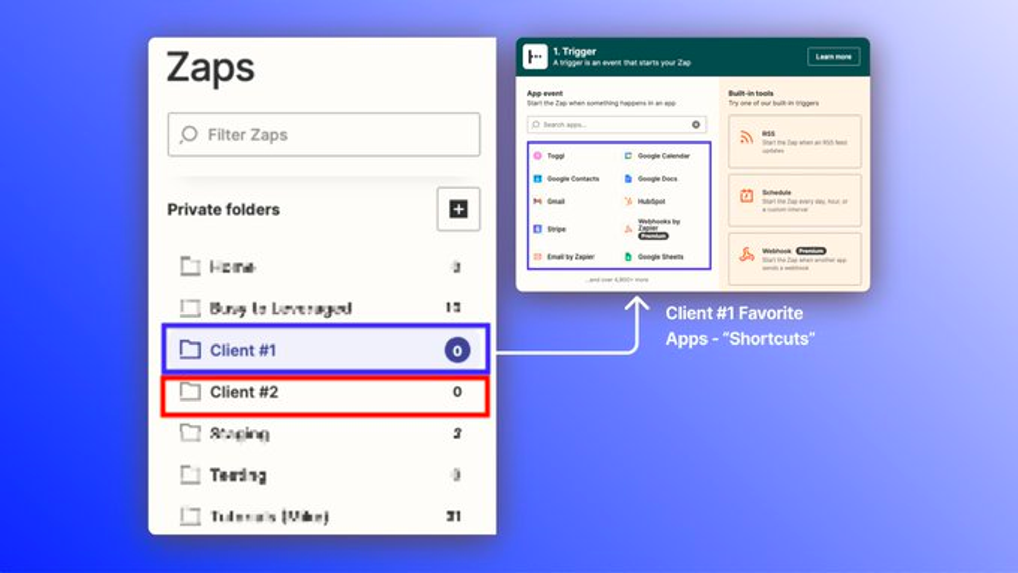
5. Automation tips by @CSMikeCardona
Great use of annotation layers to highlight steps in tutorials.
That’s all for today, don’t forget:
To be featured on the next post, tag @BrandBirdApp on your tweets ✌️
